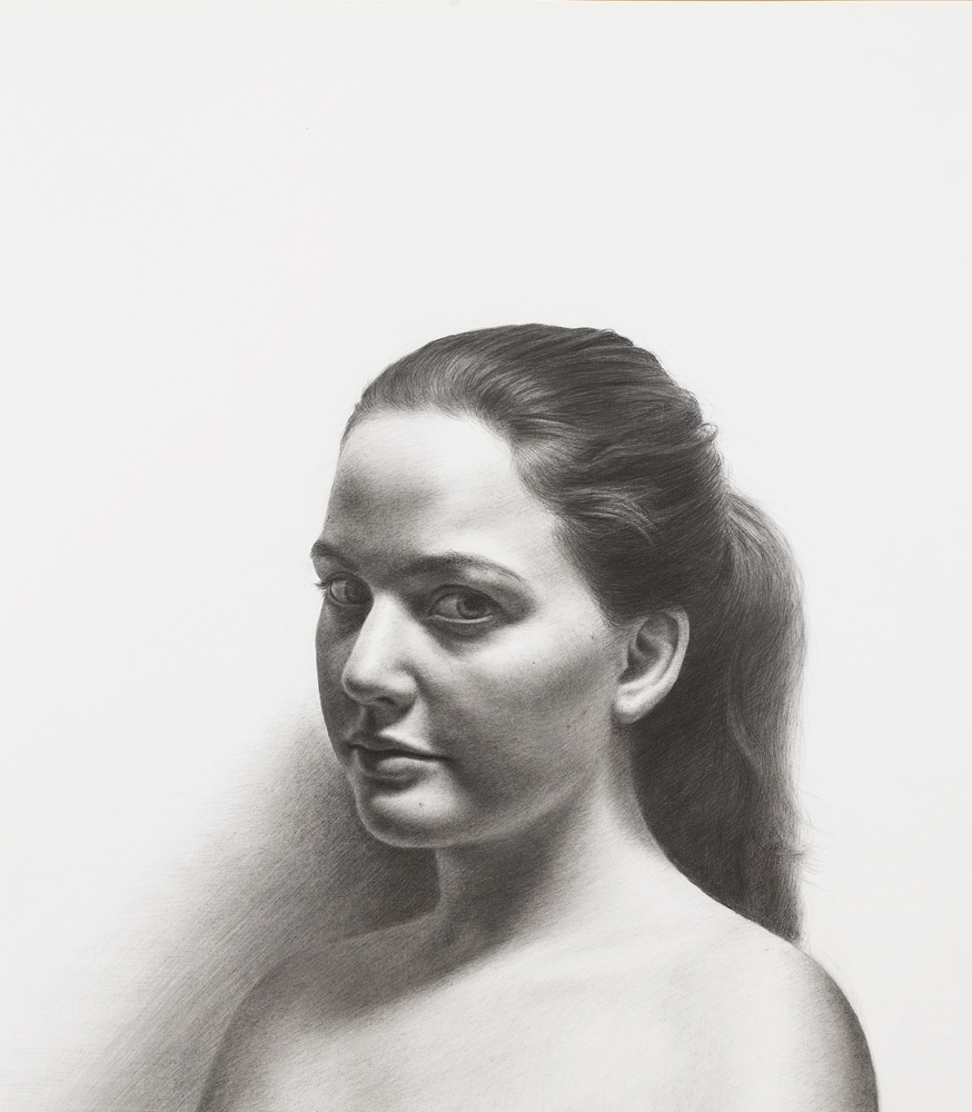
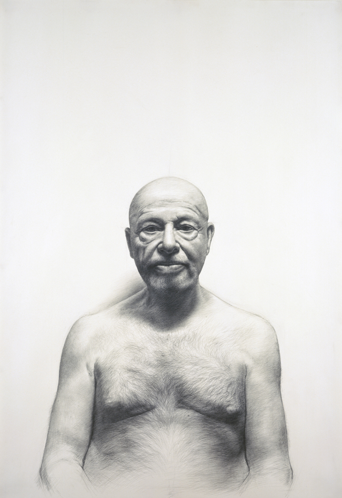
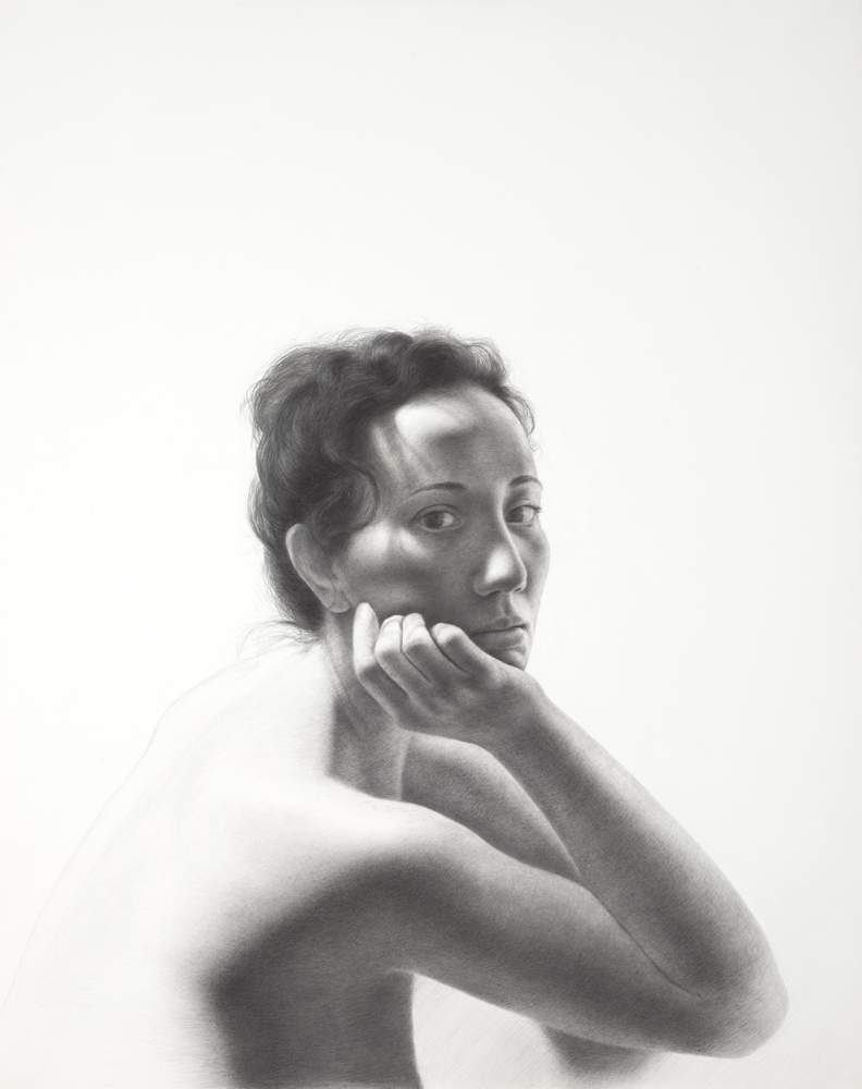
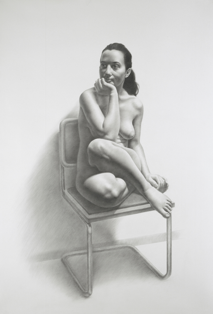
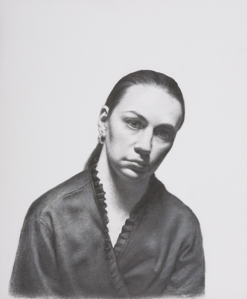
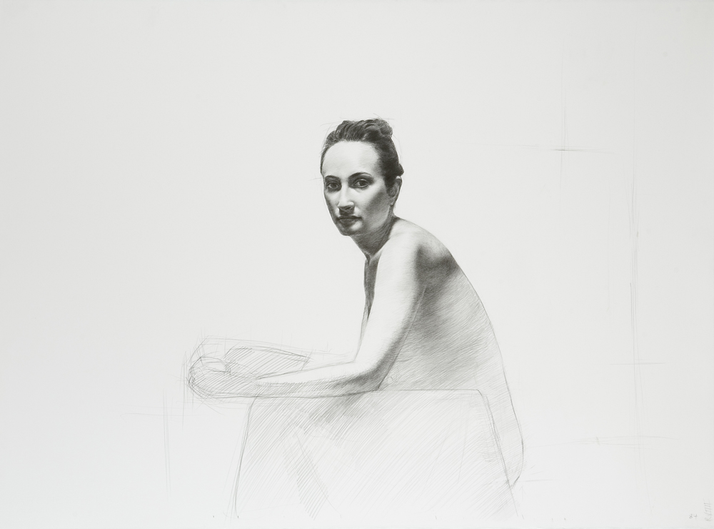
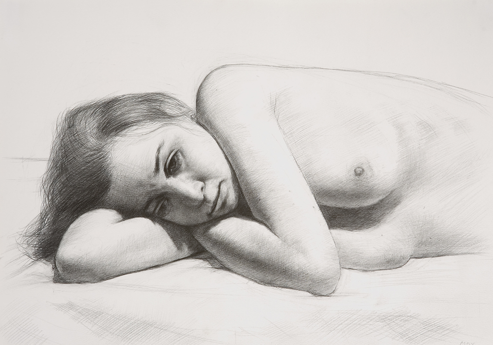
In my drawings done in graphite on white paper, the nude figures are set against a white wall bathed in light emanating from above. The white paper that represents the wall might inhabit at least half of the dimension of the overall format. This draws the viewer’s gaze to the white of the paper, which causes a major shading dilemma: How do you maintain the luminosity and translucency of the represented skin against the competing lightness of the paper? If the darker and/or lighter lights appear too early in the drawing’s development, they will appear too dark and make the skin look dirty and bruised.
In order to achieve this, I developed a disciplined shading system. The drawings are made of a dense network of cross and parallel lines built in a painstaking, patient systematic way.
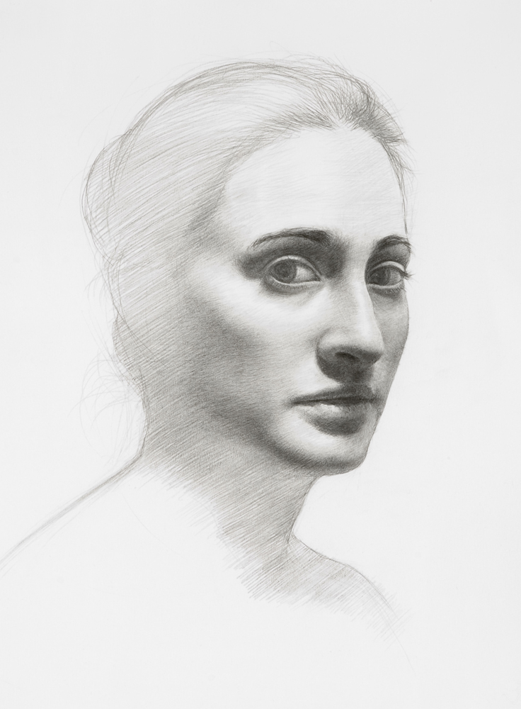
I adhere to these protocols and execute them simultaneously:
1. Always start shading at the beginning of the shadow.
2. Always shade all the way through the entire length of the full shadow shape.
3. The first shadow hatching should be one uniform hatching in the same direction usually at about a 45-degree angle. Top right to bottom left for right-handers, top left to bottom right for left-handers.
4. After the first several hatchings, alternate your strokes (45-degree, along the shadow line and horizontal) in order to keep the shadows quiet and the transitions seamless.
5. While hatching, press hardest at the start of the shadow and as you are continuing through the shadow release pressure or add pressure according to the value.
6. As you proceed, use harder and harder grades of graphite: HB, F, H, 2H, etc.
7. Use the hardest grade lead with the right amount of traction, not slippery, not scratching.
8. Relate the lights to the darks. Only start shading out towards the lights when the darks are dark and transitional enough.
9. Keep adding layers of tones all through the darks then proceed transitioning from the start of the shadow out towards the darker lights and then to the lighter lights.
10. If the lights or darks get too dark, use your erasers to bring back the value order.


Thank you so much for that info, I wish I could download it to go over it from time to time as a reminder. It’s great information of knowledge and I think you for it and all the time in class.
I enjoyed studying your portraits and admire your work and the angle of light you choose
Really helpful. Thanks for sharing this. Bookmark added.
Ótima síntese e belas composições.
Parabéns ! !
Qual o papel que utiliza ?
Abraços.
FranciscoLopes-Kiko-
Having studied drawing with you, Costa, at the Art Students League, I hear your words in my head each time I draw. The instruction and beautiful drawings you share in this blog are so helpful and I thank you.